
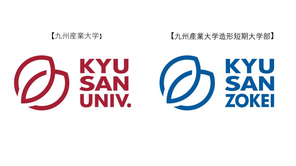
Kyushu Sangyo University and Kyushu Sangyo University Junior College have revamped their respective brand marks as of April 2026.
[Design Concept]
The design, inspired by the university emblem's motif of two leaves (a camphor leaf and a chinquapin leaf) and a circular form, symbolically represents the duality unique to our university, such as "industry and academia" and "sensitivity and practical ability," as well as the strong bonds among those involved.
The new brand mark is a simple and modern design adapted to the digital age, blending the tradition and innovation of the university's 65-year history, starting with the founding ideal of "Unification of Industry and Academia." This initiative aims to more intuitively communicate the role and value that the university plays in society, amidst declining birth rates and significant changes in the environment surrounding universities.
制作は、コーポレートブランディングに精通し、日本を代表する企業のシンボルデザインやブランディングを数多く手がけてきた株式会社ブランダーズ(埼玉県川越市)代表取締役/クリエイティブ・デザイナー 末永圭三氏が担当しました。
現在、大楠アリーナ2020前にて新ブランドマークを花々で装飾したモニュメントを展示しておりますので、是非ご覧ください。
Furthermore, at the entrance ceremony held on April 1st (Wednesday), we presented each new student with a poster featuring the new brand mark and a message of encouragement.
Along with our new brand mark, our university will cultivate the "Creative sensibility to shape the future. Practical skills to move the world." outlined in our brand message, and promote further improvements in education and research, as well as social contribution, while collaborating with local communities and industries.